I put my Kate Session Applets at the corners of my programming-related activities, and they are usually little. So it always annoyed me that the three default items that I cared little about were at the top and had to stay at the top, forcing me to scroll to load the kate sessions I’m actually regularly interested in.
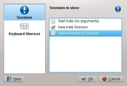
Well, I recently scratched that itch:

All items in the applet, including the default three, can now be hidden by unchecking it in the new configuration interface. And what’s more, different applet instances can hide and show different items too.

mutlu
Great addition. Thank you!